暖男空间:大连KEYMEN男装定制店
室内设计 · 商业空间
赵洋
鳞见设计工作室主案设计师
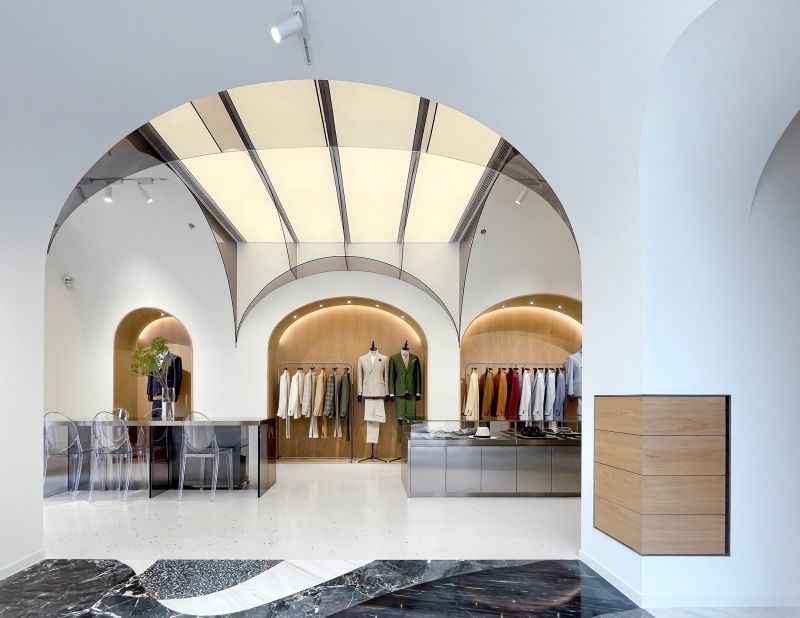
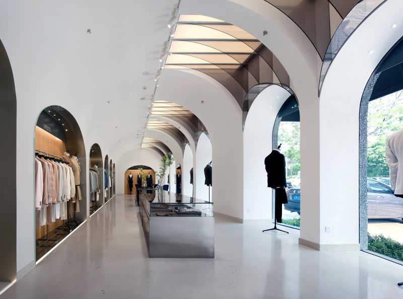
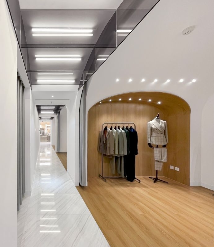
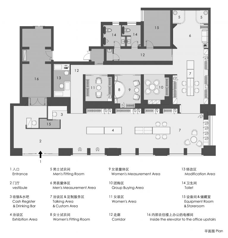
The project includes two bespoke gentlemen's wear shops, located on Zhongshan Road in Dalian city and Harbin Road in the development zone. The client hopes that they will progress at the same time and have the same tonality.“深木英伦风”。并且从风格的角度来说,我们不喜欢以一个名字定义一个风格的创作手法,例如“美式乡村”、“法式田园”,这些普遍都是符号的堆砌,而不是对具体空间感受的探讨,我们希望我们的设计结果不应该是用一个笼统的词汇概括的,而应该是饱满的、立体的、难以一言以蔽之的。First of all, the positioning of the brand is younger suits, facing younger customers, so we will not consider the general "deep wood British style" at the beginning. And from the perspective of style, we don't like to define a style by one name, such as "American countryside" and "French garden". These are generally the stacking of symbols, not the discussion of specific space temperament. We hope that our design results should not be summarized in a general vocabulary, but should be full and multidimensional.“英伦风”,毕竟西装不是中国文化的自然产物,如果我们硬性拔除这种“俗成印象”,可能会让人感觉“不像”,进一步会影响消费行为,所以我们还是希望空间中有些“欧范儿”的影子。我们对一个年轻化的空间首先考虑的就是简洁的感觉,简洁的东西也往往容易显得很男性化,而我们希望在这种男性化的感受中再找到一些柔和,更符合现代年轻人的气质,就像一个暖男。“欧式感”,而简化后的拱券同时具备简洁和柔和。“简化的拱券”作为空间线索,将空间的动线穿起来,塑造一个“暖男空间”。People have the habit of thinking, and this habit of thinking is also a part of space experience. For example, when it comes to customization, people will unconsciously think of "British style", after all, suits are not a natural product of Chinese culture. If we remove this kind of "conventional impression" rigidly, it may make people feel "strange" and further affect their consumption behavior. So we still hope that there will be some "european style" in the space. Our first consideration for a younger place is the sense of simplicity, simple things also tend to be very masculine,and we hope to find some softness in this masculine feeling, it is more in line with the temperament of today's young people, like sweet men. Arch is a common European architectural element, after geometrized, some thing interesting may appears, and the simplified arch has both simplicity and softness. So we use the "simplified arch" as the spatial clue, it puts the flownline of the space together, a "spaceofsweetmen" created.“盒子”,我们将它进一步简化后加了一个发光雨棚,晚上这里会是一个温暖的街角。The first store is located in the most prosperous area of Dalian. Its facade is a square "box". We further simplified it and added a luminous canopy. It is a warm street corner at night.“欧式”的影子。The store is a little bit small, and the entrance area is a space for exhibition and talking area. We organize it into a group of staggered arches. On the top of the center, we designed a luminous arch rib with geometric language, which is more or less Gothic. We hope it has some "european style".这里的桌椅我们也都选择了不锈钢和亚克力的材质,这样感觉更轻盈、现代、年轻化,空间中突出的主体还是产品。We also choose stainless steel and acrylic materials for the desks and chairs here, which makes them feel lighter and younger. The protagonist in the space is still products.从入口空间进入内部空间我们希望人们的感受也是越来越温暖,就像一个人的气质,越接触越发现“它”是个“暖男”。From the entrance space to the interior space, we hope that people feel more and more warm, just like a person's temperament. The more they come into contact, the more they find that "it" is a "sweetman".In addition to the space temperament, we focus on the necessary functions for further communication in the process of customized service, where customers and shop assistants can discuss every detail of customization.“小惊喜”。In addition, we also set up some "little surprises" in the space.There may be some small gifts for the guests here.这里从墙面里拉出一些面料和配饰方便定制挑选。Here we pull out some fabrics and accessories from the wall to facilitate customization and selection.我们把店里的一些特殊刺绣工艺做成相框放在桌上随时展示。We make some special embroidery crafts into picture frames and put them on the table for display.开发区店位于委托人集团公司楼下的临街商铺,这里的原貌就是一排被一个个“钻石切割形”柱子分割开的商铺,委托人希望我们能将店铺外立面设计的与相邻商铺不要太脱节,于是我们首先保留了这些“分割柱子”。由于这里朝南,白天阳光会暴晒室内的产品,所以我们从功能角度考虑直先接做一排遮阳棚。The second store is located in the street shop on the ground floor of the client group company, the original appearance here is a row of shops divided by "diamond cut" pillars, the client hopes that the facade design of the shop will not be too out of touch with the adjacent shops, so we kept these "dividing pillars" first. As it faces south, the sun will be exposed to indoor products in the daytime, so we consider from the functional point of view to make a row of sunshades.橱窗部分除了展示产品,我们希望它也能更通透,从外面就能直接看到室内的“暖男”气氛,而室内由于有一些原有结构的限制,拱形关系不能和外立面对位,我们就干脆把它们做成不同的节奏,这样走在街上向室内看反而有种特殊的动感。In addition to displaying the products in the window, we hope it can be more transparent, so that we can directly see the "sweetmen" atmosphere in the room from the outside. However, due to the limitation of the original structure, the indoorarch can not be opposite to the facadearch,so we just make them into different rhythms. Walking on the street welookinto indoors, it has a special dynamic.室内的前厅空间挑高较高,我们用一个整体的拱券贯穿整个空间,这样模糊了天花和墙面的界限,让左侧产品区的背景更加简洁,突出产品,右侧几何化的“发光拱肋”,继续延续“哥特式飞券”的形象感。The space of the front hall is very high. We use a whole arch to run through the whole space, which blurs the boundary between the ceiling and the wall, and makes the background of the left product area more concise and highlights the products, The geometric "luminous arch rib" on the right continues the image of "european style".里面的男装区继续延续“进一步温暖”的空间感受。The men's area inside continues the space feeling of "warmer".内部的走廊和前厅围合成一个环形动线,这个走廊将女装区、女装量体区、团购区、修改区穿了起来,这里的每个“隔间”我们都希望客人有种想要停留的感觉。除此之外,我们也希望这样没窗的空间反而更有趣。The inner corridor and the front hall form a circular flownline. This corridor integrates several functional spaces. We want our guests to feel like they want to stay in each "compartment" here. Besides, we also hope that this windowless place will be more interesting on the contrary.产品展柜是空间的核心,我们在这里也设计了多层次的灯光,加上更现代的展示方式,更加烘托产品的品质。The product display cabinet is the core of the room. We have designed multi-level lighting here. With more modern display methods, the quality of the products is more enhanced.卫生间是一个空间品质体现的重点之一,我们希望这里也很酷。The toilet is one of the key points of space quality, and we hope it's cool as well.


