气味翻译所
室内设计 · 办公空间
胡耀英
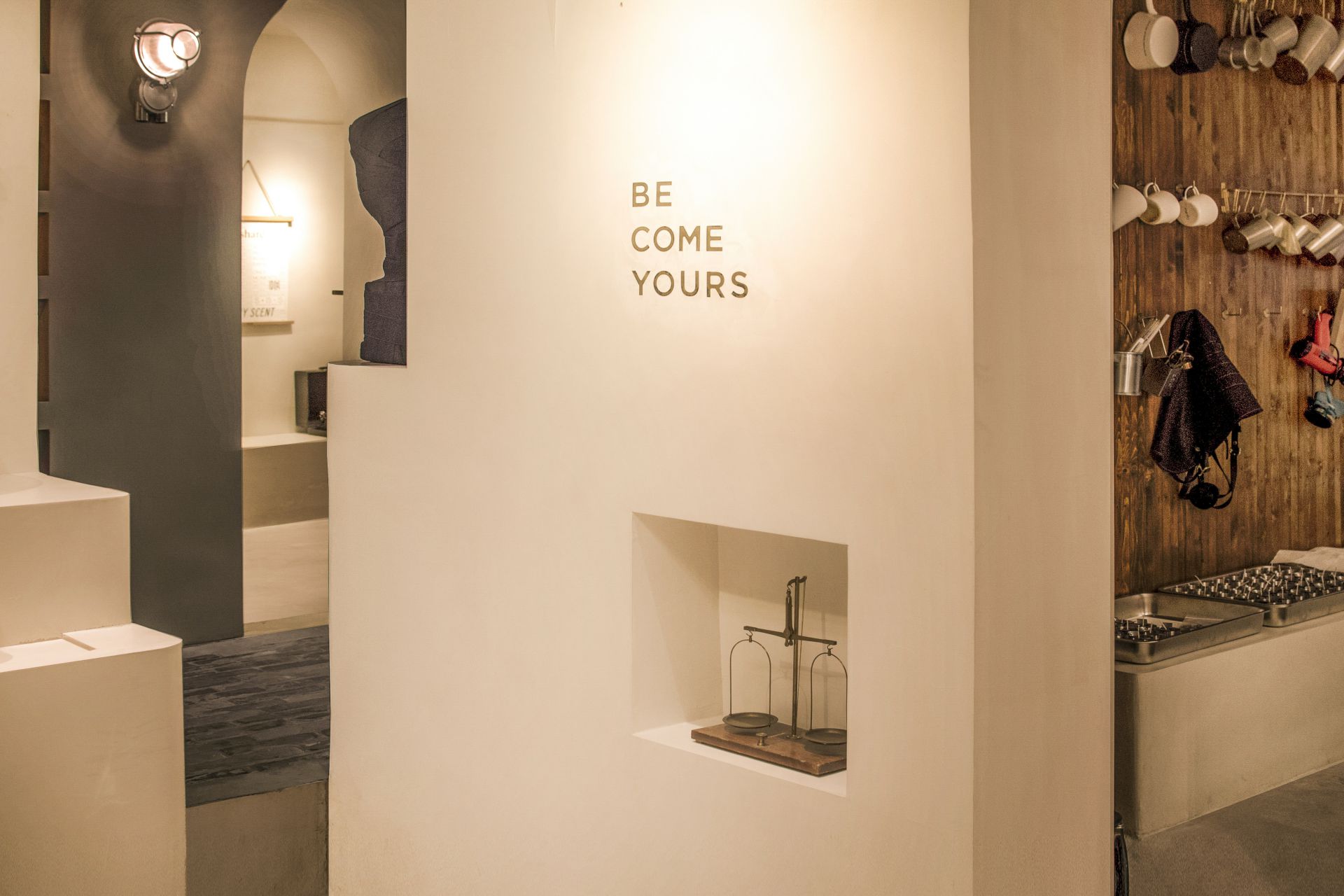
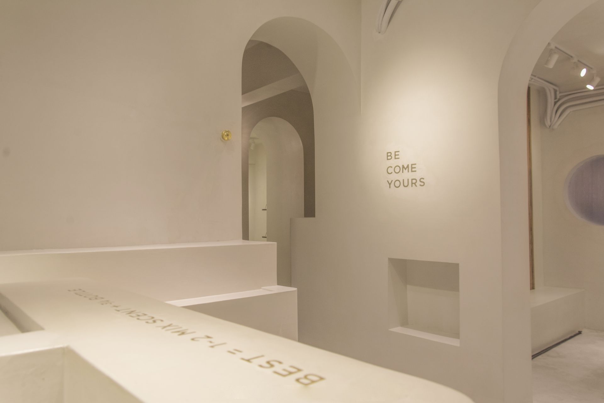
筑睦建筑设计事务所创始人
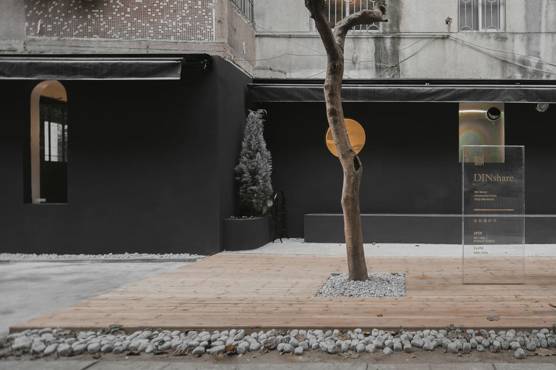
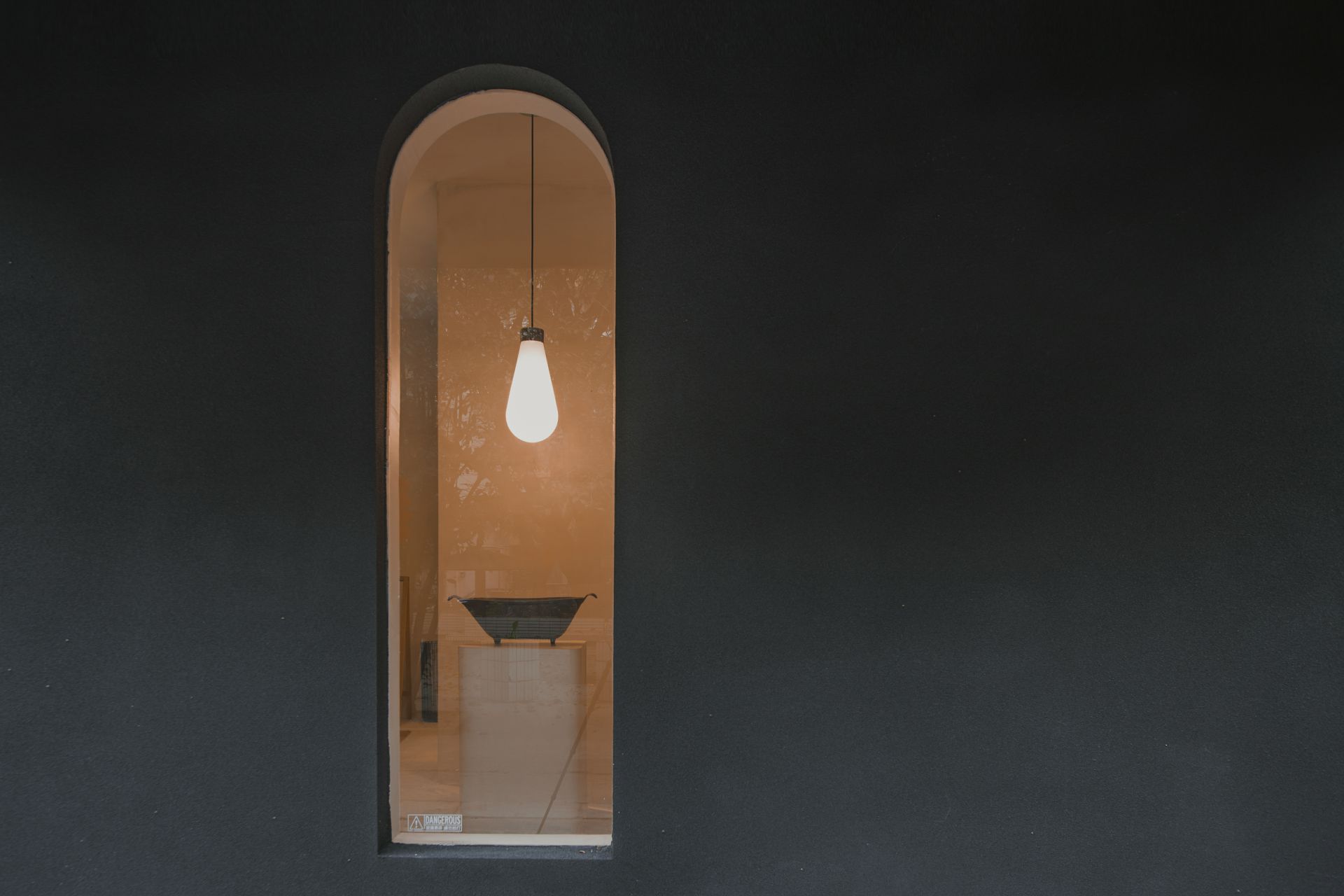
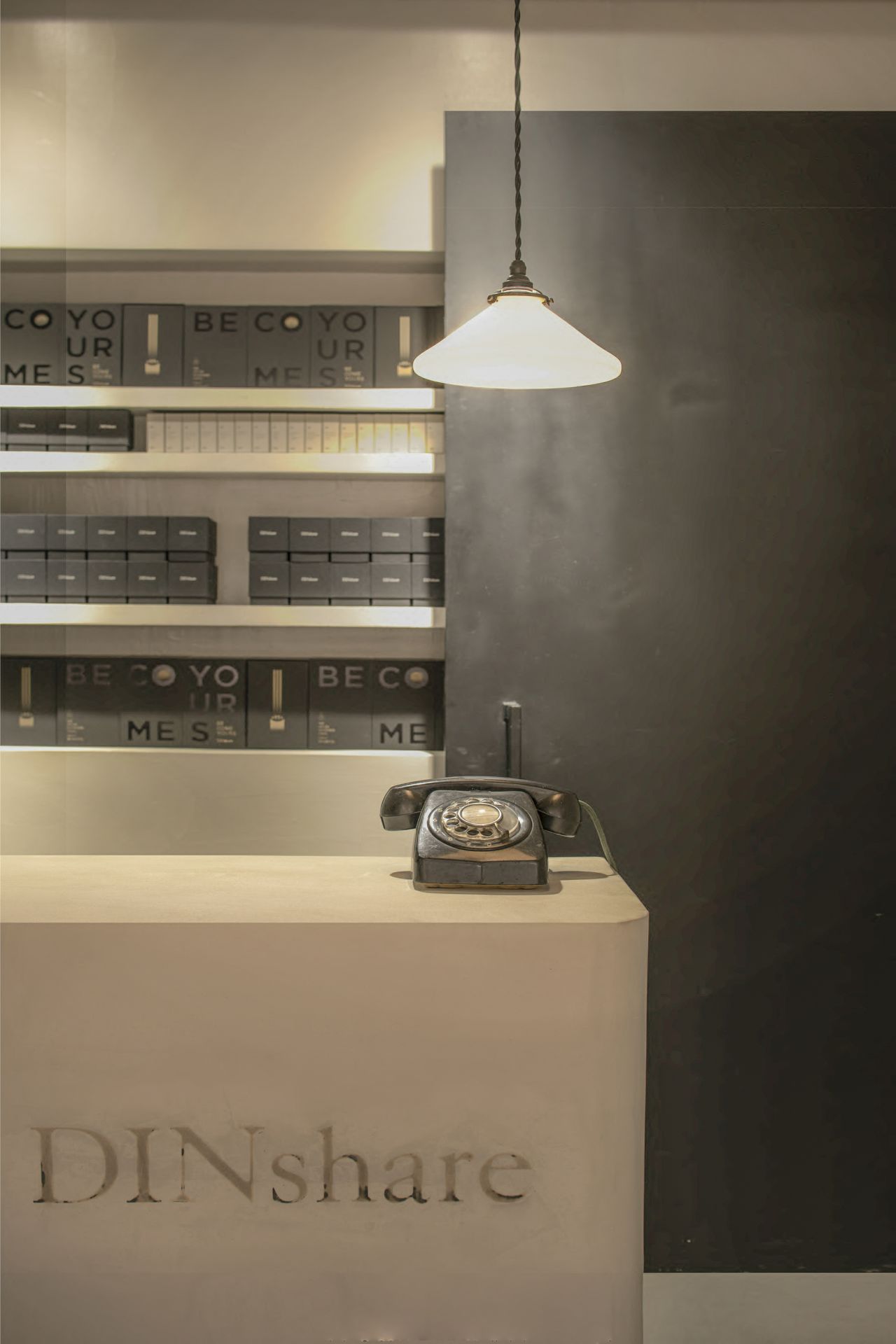
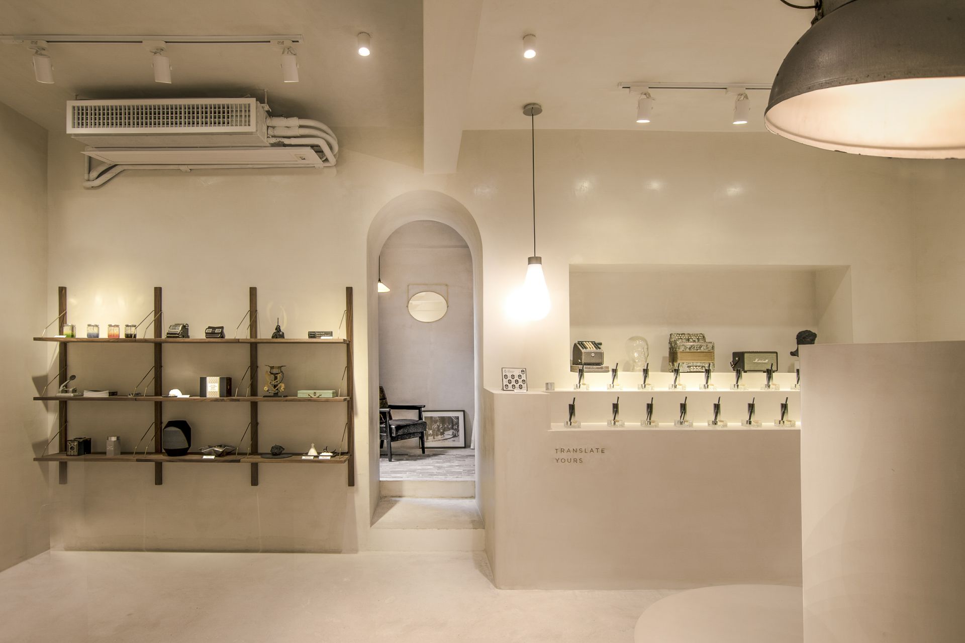
前序preface混凝土的质朴在于可以最大化空间里的其他物品散发自身的气质。The simplicity of concrete always helps the characteristics of other materials to be manifested as much as possible. --------------------------------------------------关于about本项目位于闹中取静的广州天河南小区内,这里既处于天河商圈的覆盖范围,同时因为是住宅小区的关系又增添了几分宁静。作为一个带有研究及参观属性的工坊,恰到好处。This project is located in the Tianhe South Neighbourhood of Guangzhou. Due to its excellent location, tranquility can be enjoyed while the business area can be easily found only by having few minutes’ walk. It is a right place for the workshop with research and visit attributes. --------------------------------------------------外立面facade我们似乎在打造一个用混凝土做的香水器皿。What we have created like a perfume vessel made from concrete more than a architecture. 为了满足业主低调且贴地气的空间营造要求:工作室本质上是这区的一份子,但同时也是一个独立的个体。我们商量后用了混凝土与黑色仿石漆结合的方式。这样一来,器皿的整体终于完整。In order to satisfy the owner's low-key and amiable and easy of approach space requirements:The studio is essentially a part of this village, but it is also an independent individual.After discussion, we used a combination of concrete and black stone-like paint.In this way, the whole perfume vessel is finally complete.--------------------------------------------------室内空间indoor工作室分为几大功能区,窗口新品展示区、展厅大堂、蜡烛与香薰层台展区、前台、前后仓库区、调香室、蜡烛坊、洗手间。从产品展示区到产品调制。来参观的顾客也能很好地由浅入深地了解本品牌产品的优点和特点。 The studio is divided into several areas for different functions, new product display area, exhibition lobby, candle and aromatherapy platform exhibition area, reception, warehouse, fragrance room, candle workshop, and wash room From product display area to product modulation, customers who come to visit can also have a good understanding of the advantages and characteristics of the brand's products both superficially and profoundly.--------------------------------------------------接下来,我们尝试以香水为引子为大家介绍室内空间的设计理念。we try to introduce the space with perfume as an introduction.前调,又名头香、头调、初香Top notes 业主是一个低调而有个性的设计师。在沟通的时候,业主首先就强调了,这里不希望成为网红流连之地,也不希望每天客似云来忙得不可开交,但工作室仍然是一个乐于待客的空间,我们需要在这一点上找到一个绝佳的平衡---设计尽量保持低调,但亦不失格调;有个性而又不失张扬。The owner of this workshop is a low-key designer with strong characteristic. At the first conversation with him, the owner emphasized that this workshop is not for the Internet celebrities to linger, nor be the place needed to be paid too much attention on the visitors. However, the studio is still a space to welcome guests. To satisfy these requirements, we need to find a perfect balance on the design, not only as much as possible to maintain a low profile, but also without losing style.为了符合此前提。我们协商达成一致观点,运用尽量少的甚至单一的元素来展现这一意愿。Consensus between us and the owner has been reached to fulfil the demands, using as few as possible or even a single element to show this will.空间分区上,分成了前区、工区。前区同时有收银接待以及产品展示功能,而工区则有调配、后勤、私密洽谈等的功能。除此之外,作为首层商铺空间。对外展示橱窗,和绿化带的使用都是必须考虑的空间。In terms of space division, it is divided into front area and work area. The functions of front area are cashier reception and product display, while functions of the work area are deployment, logistics, private negotiation and so on. In addition, as the shop built on the ground, external display windows and the arrangement of green area must be considered. 中调即核心调、中味 、根本所在Middle notes 我们选择了混凝土。We chose concrete混凝土能让人主观上忘却他本身的味道。当空间全部流淌着混凝土的时候,会让你更关注空间的其他事物,从而更容易让你坠入空间主人特意为你带来的体验。When the space is full of concrete, you will pay more attention to other things in the space, and the experience brought deliberately by the owner of the space can be easily acquired. 要做到这种抽象的空间体验,我们在材料运用上对混凝土依赖有加,犹如将巧克力酱满满地浇到一个蓬松的蛋糕的里里外外,大至外观,细至孔洞,满目皆混凝土的所在。空间内不同的几何造型,包括桌面地台 门框 窗户,将充满视野的混凝土可能带来的视觉疲劳减至最低。而透过窗户和业主精心挑选的各种灯具的光线照射,各个混凝土物体的表面更铺洒着微妙的高级灰变化。 To achieve this kind of abstract spatial experience, concrete is the major materials we use, just like completely enveloping a fluffy cake with chocolate sauce. The visual fatigue caused by the concrete can be mitigated by various issues with different geometric shapes, such as desktop platform and windows. Illuminated by the light from outside or various lamps elaborately selected by the owner, subtle change of the high gray can be demonstrated on the surface of the concrete object.这一切都是那么地静逸、淡雅。All this is so quiet and elegant.在这之上,当调配师工作或者参观者打开香水瓶子的瞬间,只有那一刻才会拥有的味道立刻就依附在了整个空间的混凝土上,重新定义了当时的混凝土气息。Under this circumstance, when the blender works or the visitor opens the bottle of perfume, the smell that only exists at that moment is immediately adhered to the concrete of the entire space, transforming the atmosphere of concrete at that time.而这些瞬间,会不断地发生在不同的时刻。此起彼伏,丰富万千。 And these moments. It will happen continuously at different moments. 基调,尾调Base tone不可能的可能 Impossible possibility莫里茨·科内利斯·埃舍尔(Maurits Cornelis Escher)是世界最著名的视错觉画家。他的绘画让人真正的感受到"眼见未必是实"——在他的笔下,所有一些不可能的景象都可能实现。空间的弯曲使缠绕成为可能,今天我们知道,物理空间可以因为引力而弯曲,它无界却可以是有限的,无界不等于无限。看来埃舍尔的数学思想很深刻,都蕴涵在他的画里。埃舍尔具有不可思议的魔力,征服着人们的心灵。Is the most famous optical illusion painter in the world. "Seeing is not necessarily real" is what his paintings tell people-in his pen, all the impossible scenes can be realized. Entanglement has been become reasonable by the distortion of space. Today we know that physical space can be bent because of the gravity. It is unbounded but finite, and unbounded does not mean infinite. It seems that Escher's mathematical idea is very profound, and they are all reflected in his paintings. Escher has incredible magic powers, having fascinated people's hearts. 在平层空间里,而又满布混凝土,让每一个空间拥有独立性,似乎是不可能事情。但是埃舍尔的不可能的空间暗暗地鼓励着我们去尝试讲不可能成为可能。所以,我们尝试在设计过程中将每一个空间(房间)看作独立的载体、艺术品、雕塑去看待。我们在手绘,电脑制图、甚至手工模型制作的过程中都将这点视作一个心理暗示—不可能的可能究竟是怎样。通过这点得出的空间,又会出现什么样的可变和不可预知的属性呢,这是一个相当有趣的尝试。每个空间不一定要从一种人们所习以为常的维度观赏,观察。在这个维度中,能看到他们之间的共同点和不同点。也能更好的认清每个空间独有的特质。这可能就是埃舍尔空间的乐趣所在。In a flat space full of concrete, it seems impossible that there is no relationship between different space. But we were inspired by Escher’s impossible space to try to produce something impossible. Therefore, we try to treat each space (room) as an independent carrier, artwork, and sculpture in the design process. In the process of hand drawing, computer graphics, and even manual model making, we regard this as a psychological hint—what is the impossible possibility. What kind of unpredictable features of the space created by this approach will be found? This is a very interesting attempt. Each space doesn’t have to be observed from the angles by which people accustom themselves to view the world. In this dimension, we can see the similarities and differences between them. We can also better comprehend the unique characteristics of each space. This may be the fun of Escher space.--------------------------------------------------何止混凝土details毕竟,我们创造的是一个以人为使用单位的空间,过于纯粹的表达只会让人使用的时候感到不适,我们在以混凝土为主调的同时,加入了几种“调味料”。After all, what we create is a space for people. Too pure expression will make people feel uncomfortable only. We take concrete as the main theme, and at the same time, we add several "seasonings".铜条、木板、玻璃、砖等的元素的加入,让空间多了几分生活的气息。让人不至于布满香气的空间迷失了方向。Copper, wood, glass, brick and other elements to join,it will be made the space a bit more flavor of life. People will not be full of fragrance of the space lost direction.--------------------------------------------------项目名称:气味翻译所 NAME:DINSHARE STUDIO设计单位:筑睦建筑设计事务所FAÇADE & INTERIOR DESIGN:ZHUMU ARCHITECTRUL完工年份:2019年COMPLETION: 2019占地面积:101㎡AREA: 101㎡建筑所在地:广州·中国LOCATION: GUANGZHOU. CHINA业主:DINSHARECLIENT: DINSHARE空间设计团队:胡耀英、陈永林、李杰恒、DESIGNER:BAN HU / LIN CHEN / JIEHENG LI主要材料:混凝土、铜、不锈钢、木、轻质砖、玻璃MATERIAL: CONCRETE、STAINLESS STELL、WOOD、LIGHT BRICK、GLASS
你可能对这些感兴趣
